

The other day I was designing a newspaper print ad for a footwear retailer's upcoming in-store event. Because the retailer was paying for the ad using co-op funds, it required approval from the co-op brand as well. The client loved the ad; however, the co-op brand did not. Their marketing department questioned the use of fonts in the ad. Their representative reminded me that I broke one of the old golden rules of design; I dared to use three different fonts in one graphic (The Horror!).
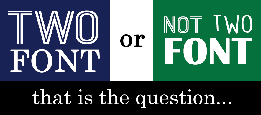
I'm always willing to accept constructive criticism and welcome it as a chance to grow and learn new things, especially as a self-taught designer. I immediately went to my newspaper to see if other designers were also "Two Font Rule" outlaws. As it turns out, the design world was full of both law abiders and rule-breakers. There was no clear dominant faction in the Sunday paper. This got me wondering, does the golden "Two Font Rule" even apply to modern graphic design?
Modern technology has no doubt, affected the way graphic designers work. Rather than manually setting type at a printing press, or drawing out typeface on a piece of paper, graphic designers have an endless amount of fonts available to download (Galarraga, 2017). Consumers also interact with media differently than they did before the advent of the computer, the internet, and smartphones. Think about how many different designs, fonts, and graphics consumers see at one time on a single homepage? Can the Two Font Rule go out the window with the newer tech-savvy audience?
"Not so fast!", say the majority of the design experts and Bloggers. Though designers can certainly be creative in how they use typeface, the "Two Font Rule" should still be the best practice utilized by graphic designers.
Douglas Bonneville, a professional graphic designer with nearly 30 years of experience in the biz, suggests using two fonts in graphics, but mixing things up a bit by using colors, weights (bold versus regular) and thoughtfully varying the kerning ( (Bonneville, 2010). He highly recommends blending two distinct fonts into one graphic so that each font plays its own role - use the more distinct font for the headline, and a more muted font for the body (Bonneville, 2010). This mix of two different fonts helps to intrigue the audience, rather than boring them like a traditional textbook. A helpful cheat that many design experts suggest is using both a Serif font and Sans Serif font to achieve the effects that Bonneville describes. I looked more at ads that I liked and noticed that the majority of those ads used the font combination methods that Bonneville describes and found that their font mixing effectively kept my attention and communicated the mood and tone of the ad. When too many fonts are used, it can be confusing and detract from the role a font is supposed to serve.
So was this it, was it time to concede font defeat? I decided to consult my design mentor Ben Courneya
, a talented and trained graphic designer with over 20 years of design experience. Ben also believed in the merits of the Two Font Rule, but also had this to say:
"I think the "Two Fonts Rule" is a useful one. As a designer, my job comes down to making countless decisions moment by moment, so having a little shorthand like that is a great way to keep my workflow steady. I find two fonts that complement each other and suit the project at hand, and boom, I'm on my way. That said, Design is also a creative field. It wouldn't evolve if nobody ever broke the rules. If a designer feels they need three, or five, or ten fonts then they should -carefully- go for it. As long as they have a reason for it, and the finished product LOOKS GOOD, then it shouldn't be a problem."
He brings up a good point, its dangerous to stifle creativity with strict rules. The Impressionists of the 19th century broke conventional art rules, and as a result, we have beautiful works of art by Monet and Renoir (not that I am comparing an ad for shoes to Monet's Haystacks
). Sometimes breaking the rules can create something new and exciting, but if you break the rules, the end product should WORK, not just be a hot mess in an effort to be different.
In the end, my use of three fonts didn't take anything away from the ad, the store saw a lot of traffic for their event, and the return rate on the coupon return rate ad was higher than average. At the end of the day, the client was happy and that is what really matters. Though I will certainly be more mindful of my design choices moving forward and use many of the techniques that experts like Ben and Bonneville suggest, I won't hamstring my creativity by being a stickler for the rules.